
Role: UX/UI Designer & Researcher
Objective: Design a user-friendly and visually stunning mobile app for a luxury jewellery brand, focusing on enhancing the shopping experience, building trust, and driving conversions.
Tools: Figma, Figjam, Zoom, Lookback.io
Process: Research and Discovery, Ideation, Design, Project Handoff, Reflection.
Timeline: 6 Weeks

Problem Statement 😟
Challenge
Goal
Research and Discovery 🔍
Client 💼
Client Background:
Key Requirements

User Interviews 👥
Objective 🌟
Identify pain points and preferences of potential users.
Methodology 💫
Key Findings 🔍

User Interview Insights Table
Competitor Apps Review 📱
Objective 🌟
Analyze competitor apps to identify strengths, weaknesses, and opportunities for differentiation.
Methodology 💫
Key Findings 🔍

Competitor Apps Review Table
Key Insights from Research 📱
Performance and responsiveness are critical for retaining users on mobile apps.
Style Guide 🚀
🎨 Color Styles


Typography 🖍


Icon Style 🖍
All icons used are from Huge Icons Pro Plugin on Figma
Ideation ⭐
User Persona 👩🦰
I mapped out different types of users (e.g., first-time buyers, collectors, gift shoppers) to understand their needs.

User Flow ✍️
To ensure a smooth and engaging experience, I mapped out user flows that define how users interact with the jewelry app. The goal was to create a seamless journey from product discovery to purchase while minimizing friction.
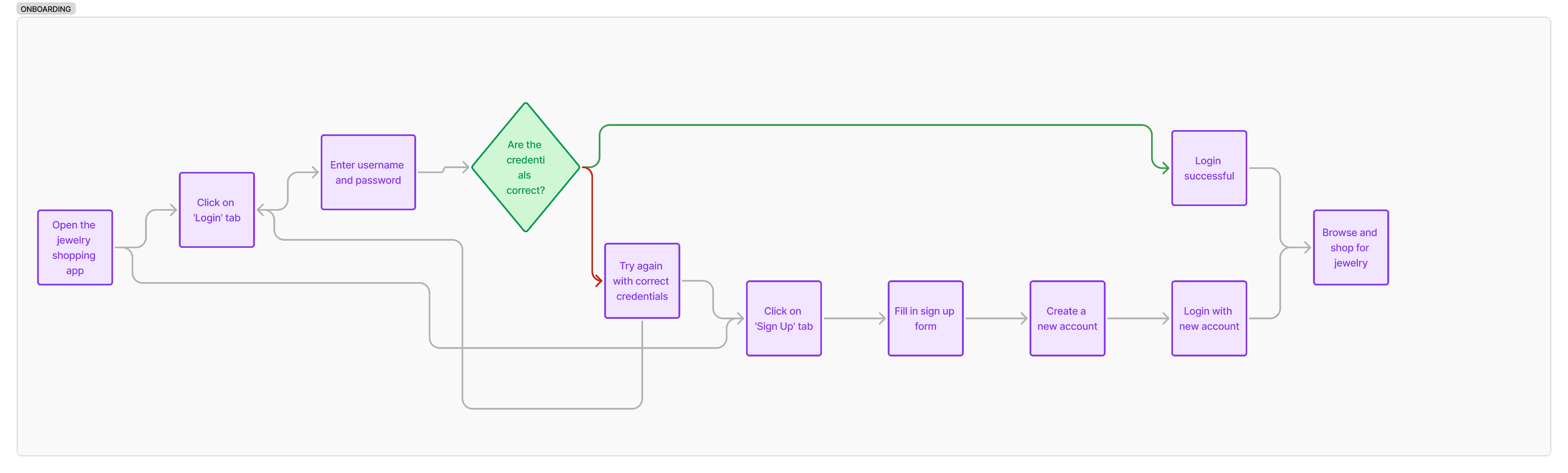
Onboarding userflow
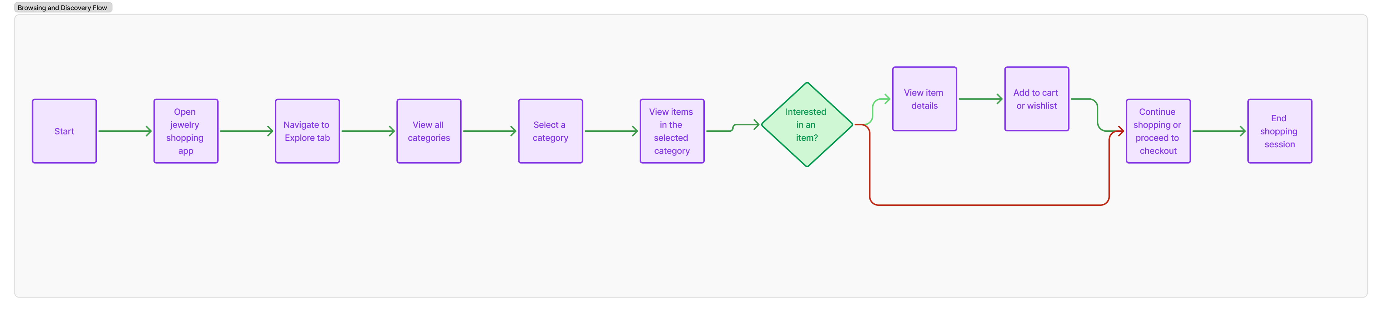
Browsing and Discovery Flow
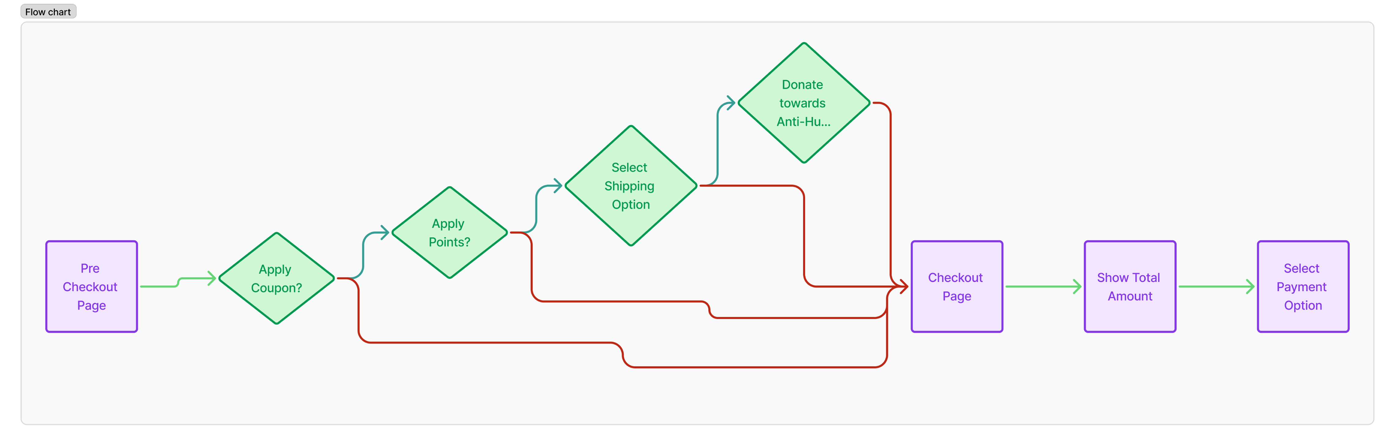
Checkout Flow
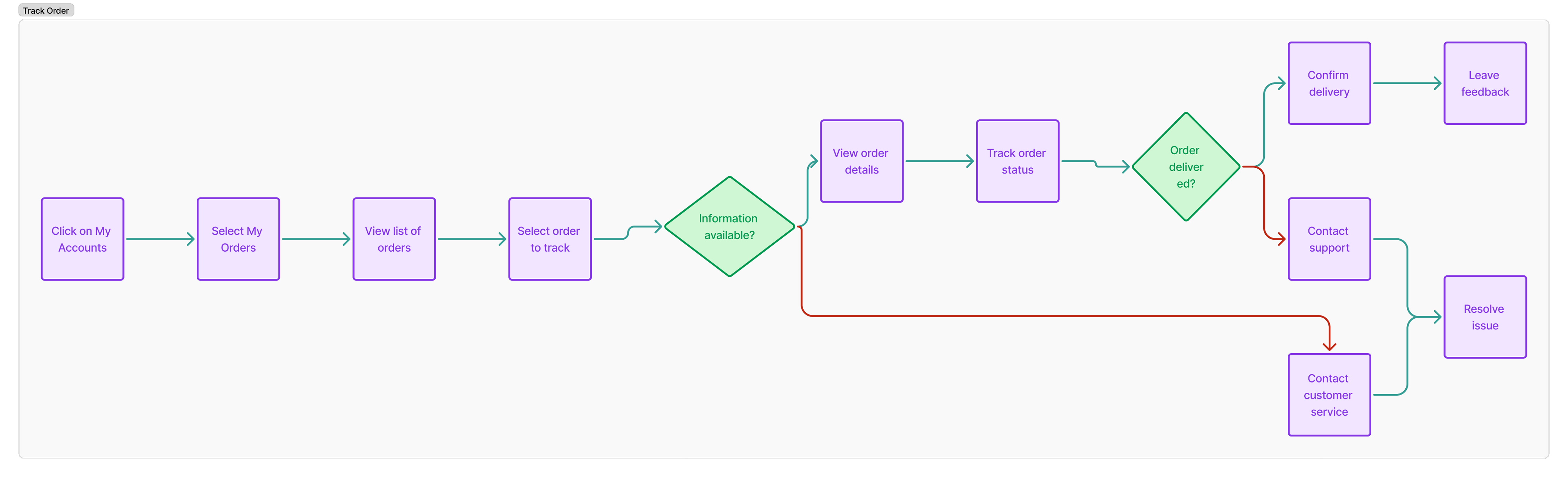
Track order flow
Low Fidelity Sketches ✍️
Before moving into high-fidelity design, I created low-fidelity sketches to explore different layouts and user interactions. This stage allowed me to quickly iterate on ideas, test usability, and refine navigation without investing too much time in details.

Hi Fidelity Screens 🌈
Splash Screens


Login and Sign Up


Home and Product Page


My Cart

Checkout Page

Explore Tab


More Tab


Track my order


Other Screens


Testing, Result and Impact ✨
User Interviews 👥
After finalising the prototype, I conducted usability testing to evaluate how users interact with the app. The goal was to identify pain points, validate design decisions, and ensure a smooth user experience before handing it over to the developers.
Methodology 💫
Key Findings 🔍
Dev Handoff 👨💻
Annotations and Measurements 📐
Along with the wireframes, the client and developer team were provided detailed high-fidelity mock-ups that depicted interactions, animations, dynamic behaviors, and spacing between elements to guide the implementation of the final product.


Conclusion 🎬
Reflection ✨
Working on this jewellery app project was a valuable experience that deepened my understanding of user-centered design, usability testing, and the importance of refining details to enhance the shopping experience.
1. Key Takeaways: User Feedback is Essential
2. Simplicity Enhances Engagement
3. Trust Signals Matter
4. Iterative Design is Key
Overall, this project strengthened my ability to balance aesthetics with functionality, ensuring that design decisions are both visually appealing and practical for the end user. Moving forward, I’ll continue applying these insights to create even more effective, user-focused designs.
More Case Studies

Little Learners Website
School Landing Page

Thrive Dietician Web App
Healthcare

Creque Mobile App
Fintech

Agency Website Template
Agency
